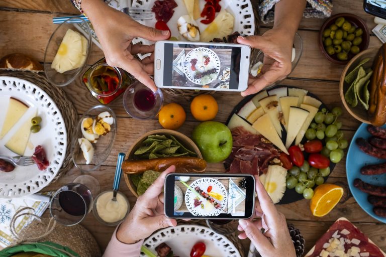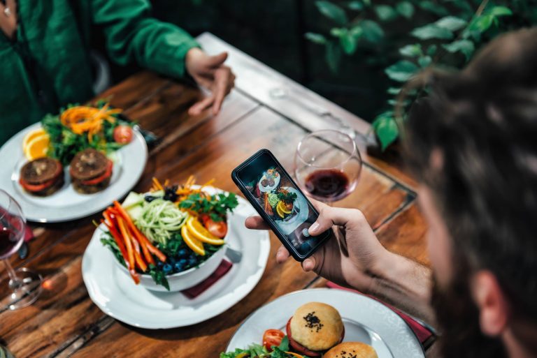
The Composition is the unsung hero in food photography, that helps you direct the audience’s attention and thereby influences the impact of the photograph. If the items are just thrown in, then there is no coherence, no visual equilibrium and no storytelling in the image, whereas if it is carefully placed there are. The rule of thirds still applies here, which basically suggests that the subject needs to be placed in the middle of any of the lines or intersections, to attract the attention of the viewer. If it’s a stack of pancakes, then there needs to be some amount of negative space in front of it and behind it, to allow the viewer to feel the image, and also hold their attention throughout the frame.
There are plenty of other leading lines you can use in your photos to draw the viewer’s eye to the hero, like the trail left by a swipe of sauce, the shape of a spoon handle, the crumbs you trail to the hero, or the grain of a wooden cutting board. You can use these leading lines to add some dynamism to your photo, making it feel more dynamic than a static photo, and also more inviting as if asking the viewer to come and investigate. Of course, some leading lines are more obvious than others and it’s the more subtle ones that work best.
But, frames, on the other hand, close in and contain the subject matter, if only to suggest that it’s special, that you can eliminate some of the chaos when you need to. A natural frame can be a bowl edge, a hanging tree branch, an open cookbook, or even a folded napkin. A frame will lead your eye to the center, confining the food from its environment. It’s more dramatic, more emotional. It suggests the food is more special, more worthy. In a frame, what’s included and what isn’t becomes a choice, and so, there’s an implied suggestion that it’s a better, more perfected world.
Negative space is what brings calm to a chaotic scene. It’s space that adds emphasis, adds sophistication, and it adds modernism. And that’s exactly what shooting in negative space can achieve. Give your subject lots of empty space, just like a dew-kissed cherry tomato or a dainty espresso cup, and the result is a sophisticated photo that will appeal to the senses. It’s all about placing attention to details by not showing every detail. I find that when you allow yourself to hold back on including all you see, you’ll take more memorable photos. So, remember, it takes practice to show restraint in filling up every bit of a photo, but it’s worth the result.
Perfect symmetry and patterns have a different appeal – it satisfies our craving for order and patterns – yet still offers scope for creativity. A perfectly symmetrical shot can be very calming and an idea choice for a fine dining or editorial photo. Rows of identical macarons, garnishes on either side of a dish, identical ingredients spaced at equal distances, etc., are all examples of a symmetrical shot. Introduce a little discord by offsetting something or placing an odd element in an asymmetrical manner to avoid the image looking too clinical. Similarly, patterns that appear organically in food (the swirl of a cinnamon roll, the spokes of a sliced radish, etc.,) highlight the food’s beauty and create a soothing rhythm that is memorable.
The sum of all these compositional considerations are what make a food photo more than just a record of what you ate for dinner. Every choice made with respect to what you place in the frame, how you organize them, what lines you create, the space between things, and how it’s all balanced are a part of a collective message to the viewer. As you continue to shoot and refine your composition skills, you will notice that a simple tweak here or there will make an image go from nice to great. With time and study, you will develop your own visual language and that will help your photos reflect the delight of food that you aim to capture.